Tovena
Tovena Nestled in the artistic and eco-conscious city of Austin, Tovena began as a fusion of environmental passion and a love for cozy, ambient lighting. The brand was born out of a desire to create candles that do more than just light up a room – they tell a story of sustainability, artistry, and wellness. […]
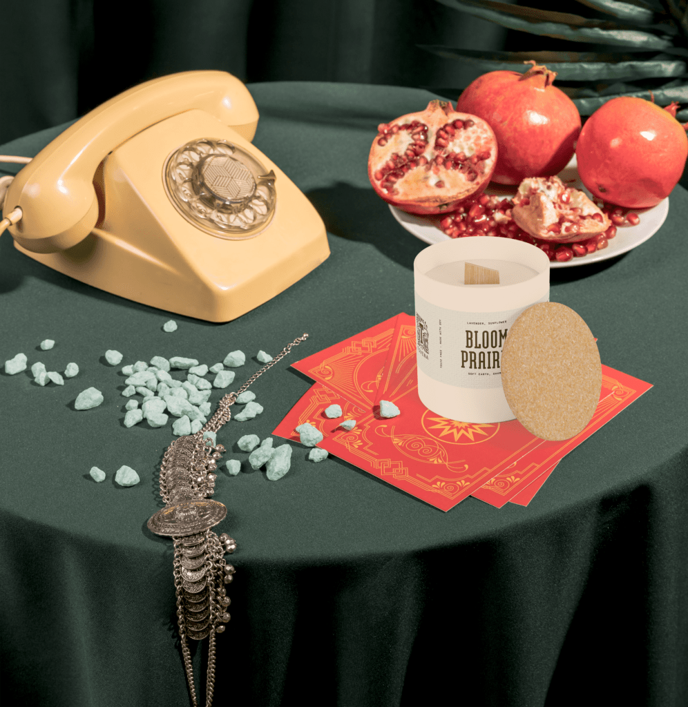
Blooma

Blooma Blooma is a flower shop run by a married couple who found each other through their shared love for the florist industry. They wanted to fill in the gaps where other florists fell short, that’s why Blooma offers a selection of services for anyone wanting to spruce up their home, office or other spaces […]
