Berry Babes Co., founded by Tyra and Lilly, is a handcrafted chocolate-dipped treats & cake biz. They are expanding to their first store front location & need a brand identity that’s going to help keep them cohesive & consistent!
The Goal
The mission was to design a brand identity that’s playful, feminine, and friendly, capturing the hearts of romantic, dessert-loving customers. Berry Babes Co. needed to stand out as the go-to for chocolate-dipped treats. The branding and packaging had to be versatile, with a logo that works in different formats and a memorable logomark. And, of course, the packaging had to leave a lasting impression, making every customer feel special and excited about their treats.
scope of work
Brand Identity
Illustrations & GIFs
Packaging design
Industry
Food
Photos are not mine, they were collected from Pinterest, Google and WeHeartIt
the process
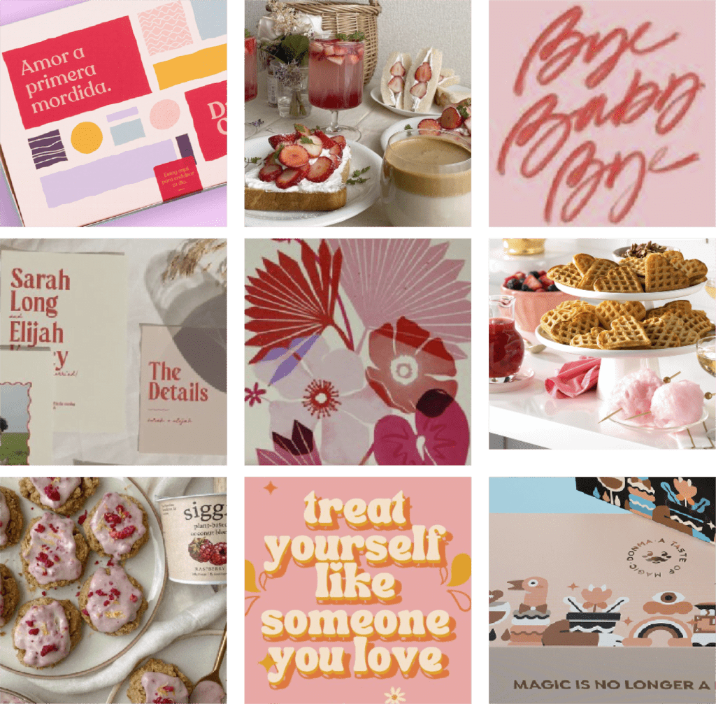
I started with a moodboard to nail down the color palette and messaging. Inspired by vibrant pinks, reds, and warm tones, it set a romantic and playful tone.
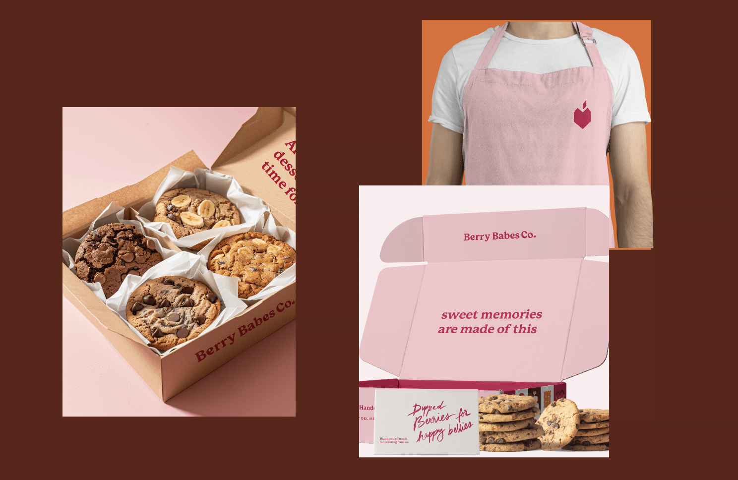
I wanted the brand identity to feel playful, feminine and friendly. I took a creative approach to the logotype by designing a handwritten font luring romantic, dessert-loving customers. The colour palette veers towards pinks and reds to invoke galentine vibes. The logomark is a heart-shaped strawberry, positioning this brand strongly in the chocolate-dipped treats segment as a romantic and friendly dessert brand.
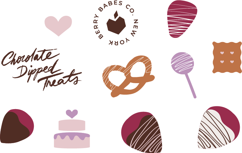
illustration style
To give the brand some extra personality, I created a graphics kit of hand-drawn illustrations. These included Berry Babes Co.’s signature delicacies and other fun elements. The flat, playful, and simple illustrations let the colors shine, enhancing the brand’s cheerful character. This style brought the brand to life and provided versatile elements for various media.
Personal Touch with Handwritten Text
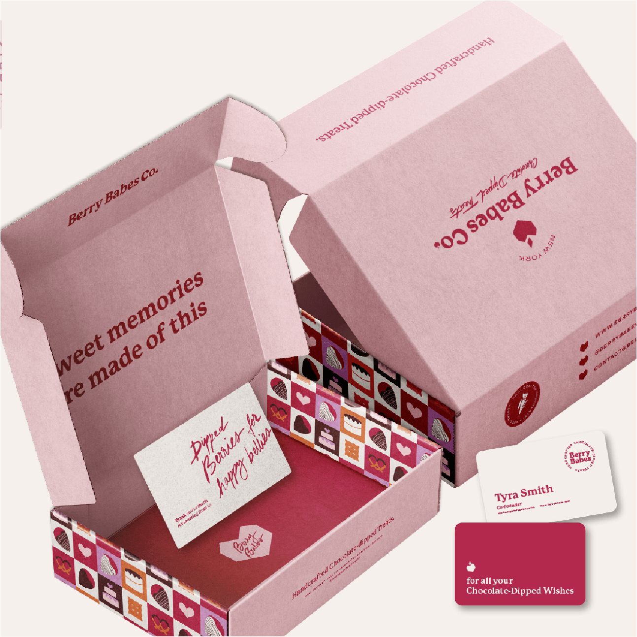
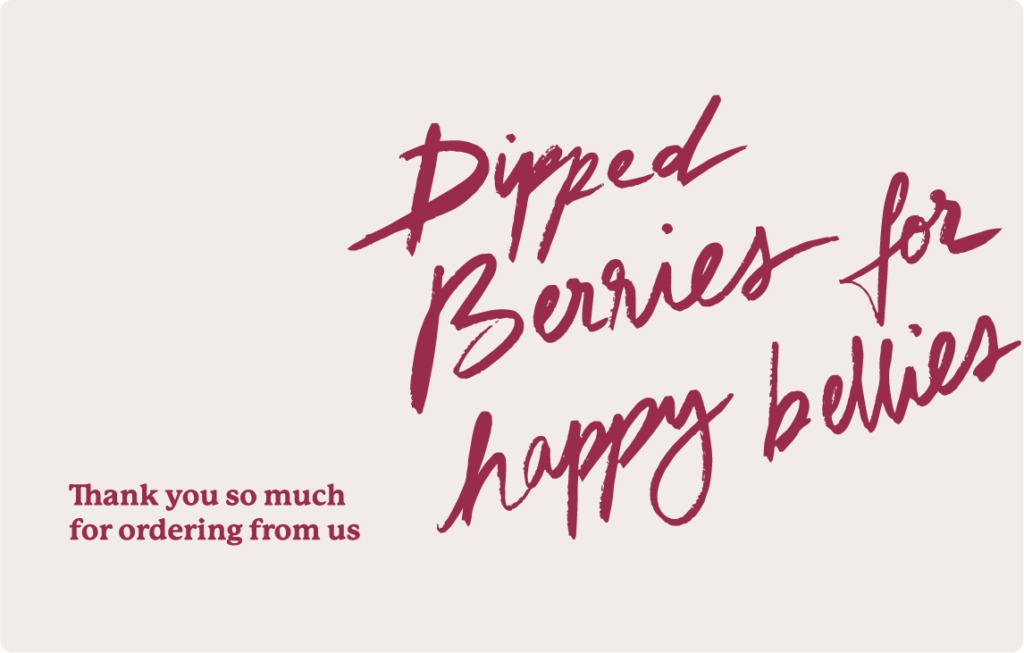
Adding handwritten elements gave the brand a personal touch, making each customer feel special and connected. This approach highlighted the handcrafted nature of the treats and reinforced the brand’s friendly, approachable vibe. Handwritten text conveyed warmth and authenticity, making the brand feel more human and relatable.
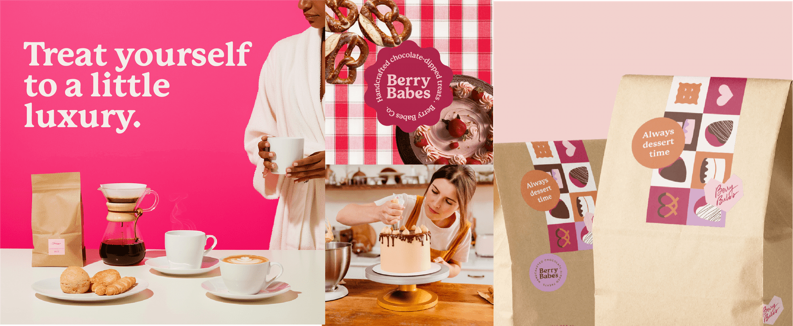
packaging design
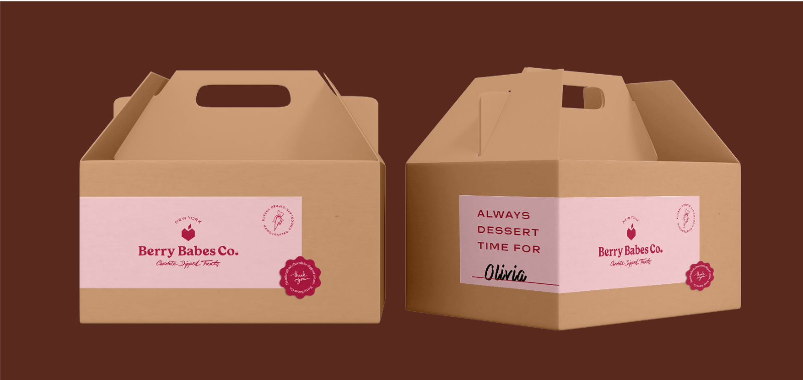
The packaging was designed to be a little luxury treat for yourself. Each delivery box included a name tag with the brand’s slogan, ‘It’s always dessert time for…’ followed by the customer’s name. This personalized touch made the unboxing experience unique and delightful. Using premium materials and thoughtful design elements, the packaging felt special, reinforcing the brand’s promise of quality and indulgence.
Store Concept
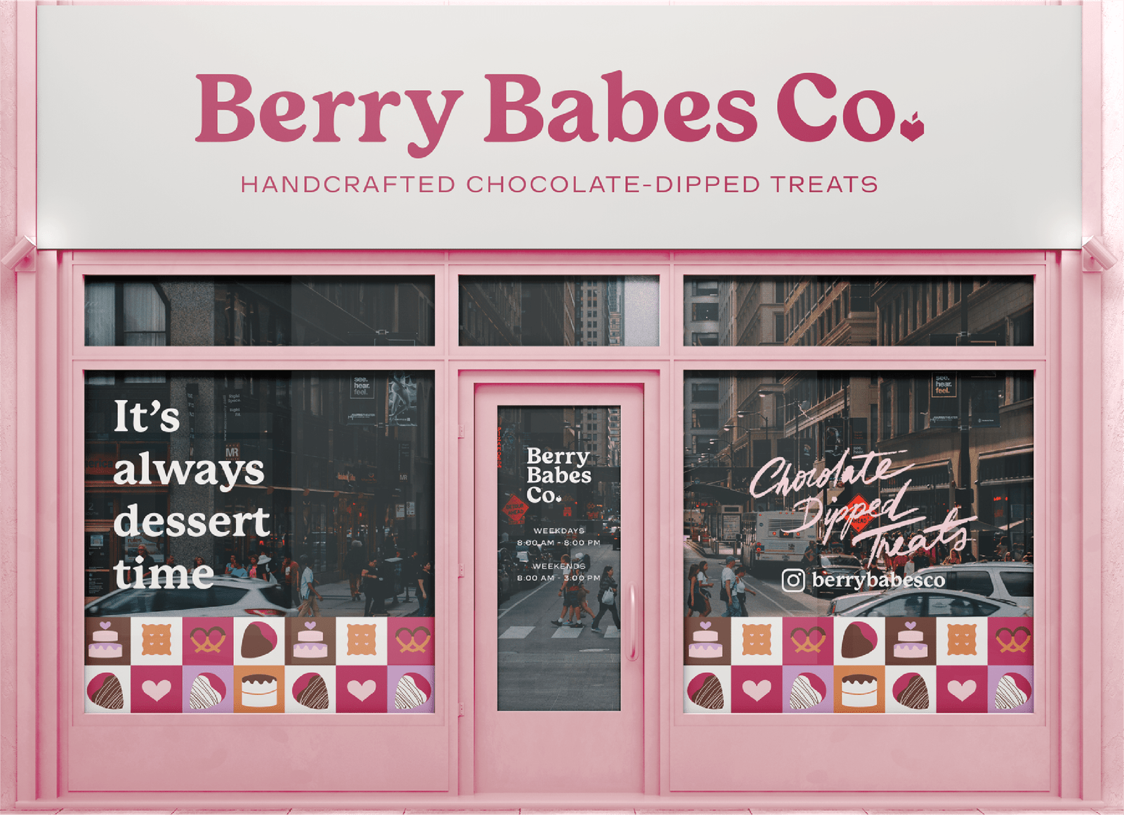
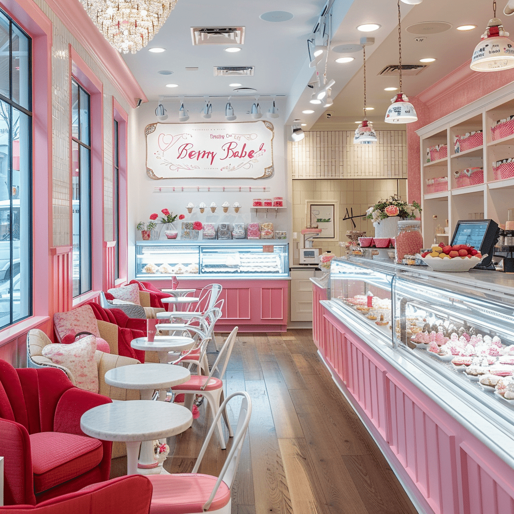
For the storefront, the goal was to create a welcoming, charming atmosphere that perfectly aligns with the brand’s identity. Soft pink hues and elegant displays invite customers into a sweet, romantic escape. The store design focused on creating a memorable in-store experience, making customers feel cherished and indulged from the moment they walk in.
This photo was AI generated.
branding & web design studio for lifestyle & ecommerce businesses