The Tea Collective is an award-winning Australian boutique tea store. They are all about celebrating the art of tea drinking with beautifully crafted products that elevate the everyday ritual of tea time.
When the founder, Becci Fowler, reached out to us, the goal for The Tea Collective was two-fold: first, to elevate their existing packaging designs for certain products because the current designs didn’t align with their brand identity. Second, to create new packaging designs for their new product, the Gift Collection. This new line needed to reflect the luxury and specialness of their offerings.
Brand Pattern
Packaging & label design
Illustrations
Icon design
Marketing Collateral
Food & Beverage
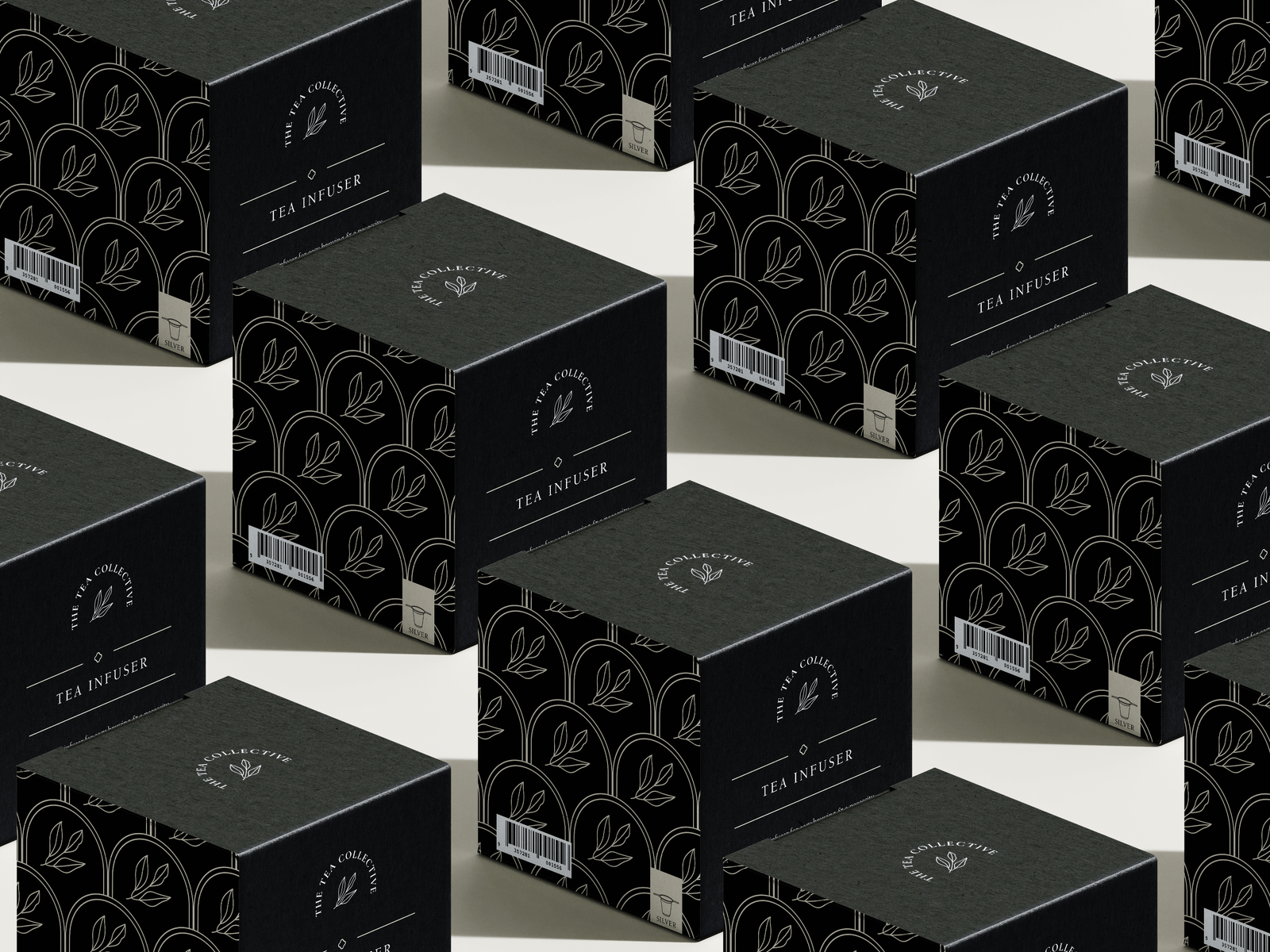
We started by understanding the brand’s identity, market positioning, and customer expectations. o make the brand identity stronger and more recognizable, we designed a unique brand pattern using the logomark, the leaves. This pattern became a central element in the design for various products including candles, tea infusers, and teapot packaging.
The new pattern design features thin, elegant curves that mimic the orientation of the text in the logo and the brand’s submark. This pattern is simple yet sophisticated, creating a unified look across all packaging materials.
To enhance the usability and user experience of The Tea Collective’s products, we designed custom icons that clearly explain how to use their products. These icons were integrated into the packaging, providing a visually appealing and informative guide for customers.
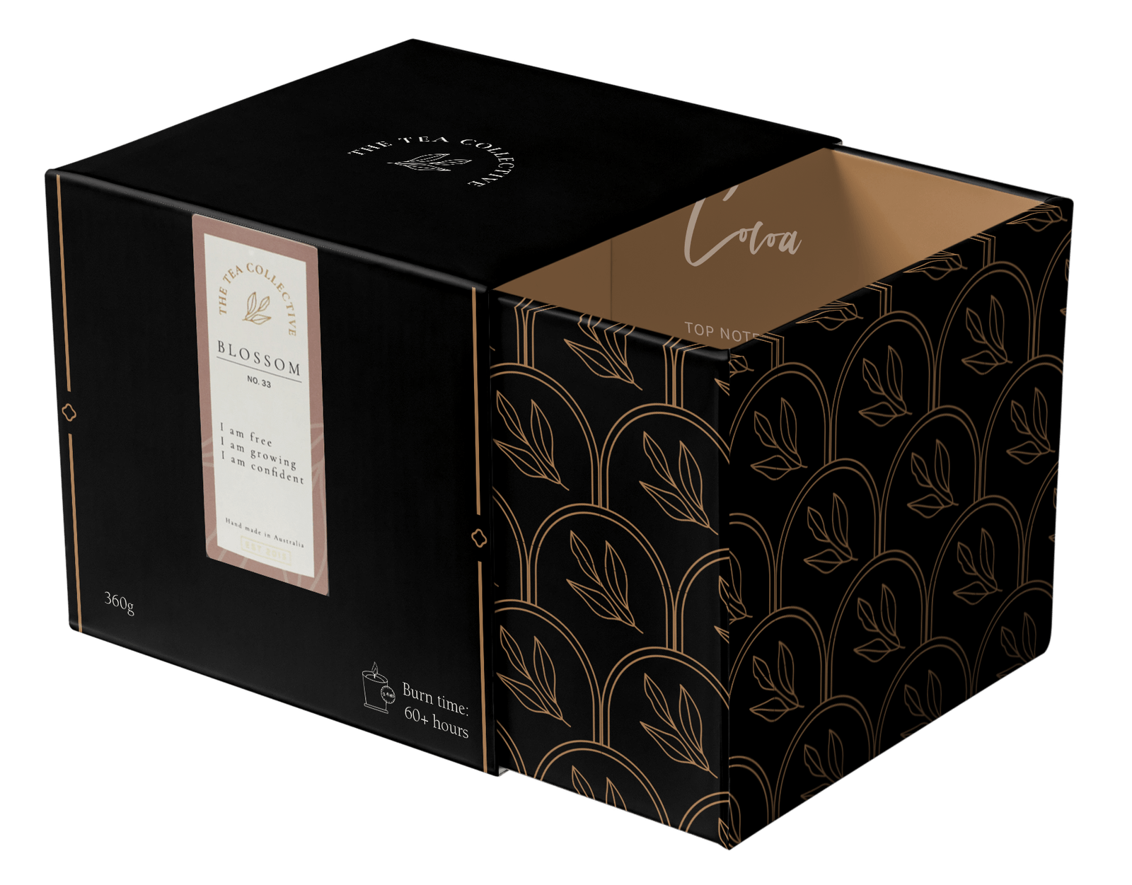
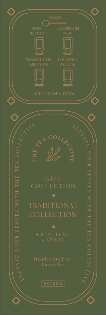
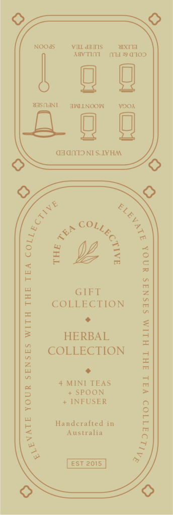
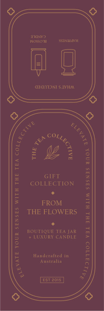
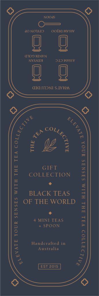
The gift collection packaging includes both the box and the label, designed to offer a luxurious unboxing experience. The goal was to create packaging that feels special and luxurious, perfect for gifts. Each gift box design features unique patterns and illustrations that align with the overall brand identity and enhance the gifting experience.
For the label design, we aimed for a minimalistic approach with clean borders and icons. Each label is tailored to the specific collection, featuring illustrations that represent the contents, making it easy for customers to identify the different offerings. The use of gold foil on the labels added a luxurious and high-end feel to the overall design.
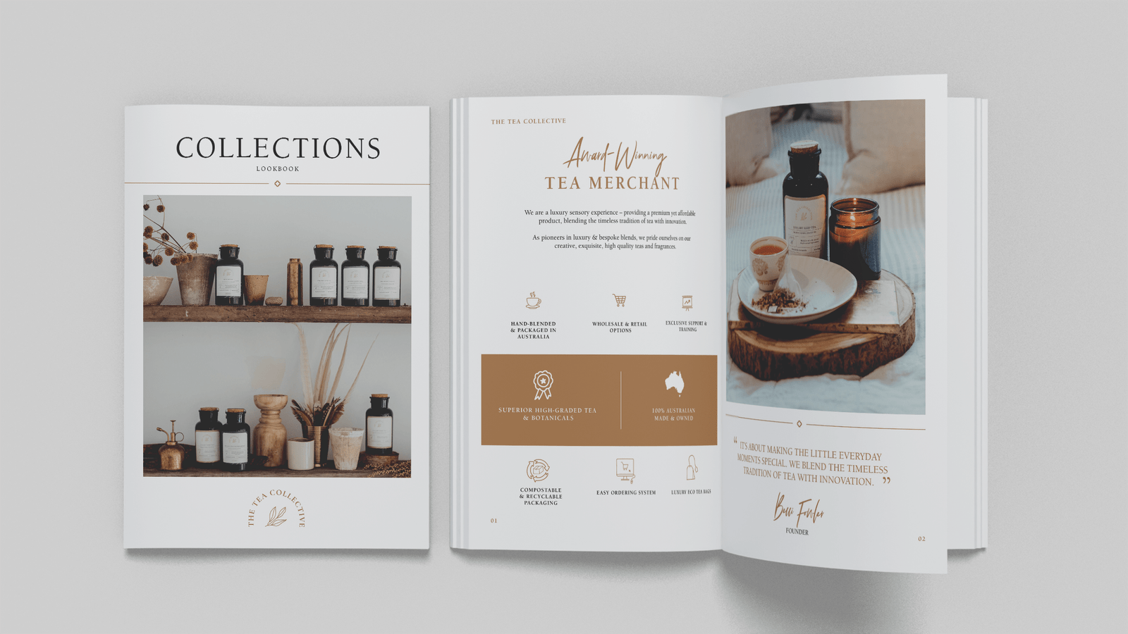
We also revamped The Tea Collective’s lookbook for wholesale, ensuring it matches the new brand aesthetics. The updated lookbook is designed to showcase the products in an elegant, appealing way, making it a valuable tool for attracting and informing potential wholesale partners.

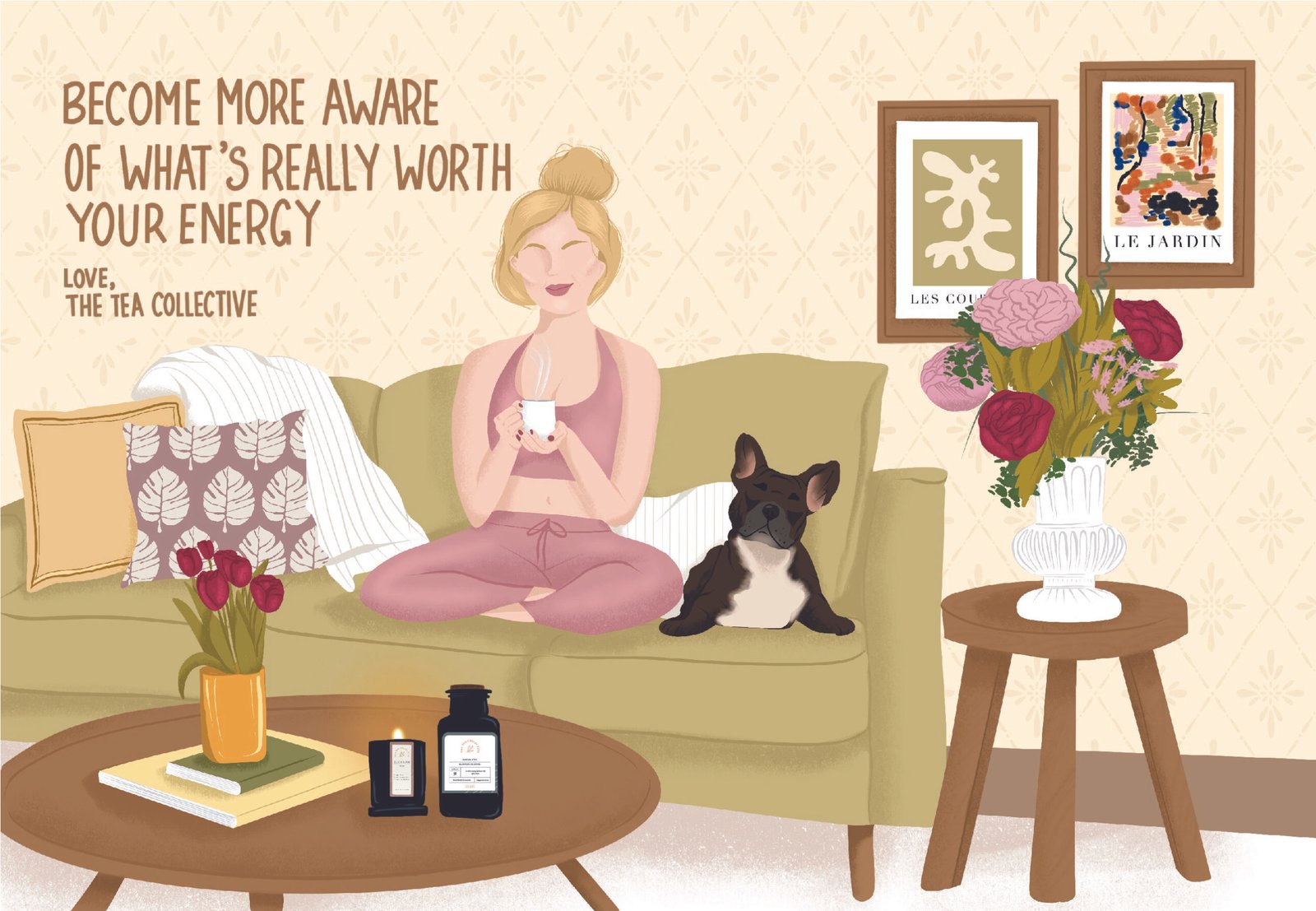
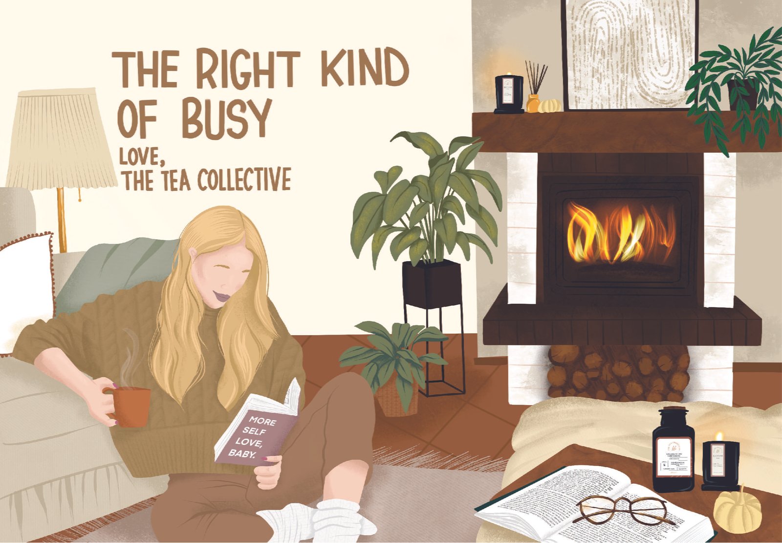
And finally, we created custom illustrations for postcards included in their packages. These postcards feature beautiful, hand-drawn illustrations that align with the brand’s aesthetic and add a personal touch to each package, enhancing the overall customer experience.
By tailoring illustrations to different seasons, The Tea Collective can connect with customers more effectively. The spring and summer illustration is bright and cheerful, while the fall and winter illustration is cozy and warm. This seasonal relevance make the products feel more timely and thoughtful.