A case study
Te Hapori Ora - The Village Of Wellbeing
Te Hapori Ora is a New Zealand-based, non-profit organization, focused on community well-being. As indigenous practitioners (Māori), they provide a selection of Social Services that include: Practitioner Supervision, Counseling, Visual Coaching, Wellbeing Wānanga (like a course, programme and event all rolled up together) focusing on individual, family, and community wellbeing. I was commissioned to rebrand Te Hapori Ora, redesign their website and collateral.
The Goal
The organisation have spent 3 years experimenting with different mediums and approaches to create a structure/service/products that works best for their organisation/community. They were also now expanding their services to other indigenous and migrant communities in New Zealand so they wanted to polish their brand identity with good branding practices.
scope of work
Brand Strategy
Brand Identity
Website Design & Development
AI-generated Stock photos
Brand Collaterals
Industry
Social services
defining the brand
I conducted an in-depth strategy session remotely using a combination of screen sharing technologies and video. We discovered their purpose, vision, audience persona, what makes them different from other similar social service organisations etc.
What emerged was a clear brand story, personality, messaging and voice for Te Hapori Ora.
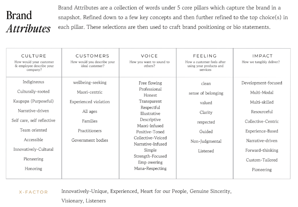
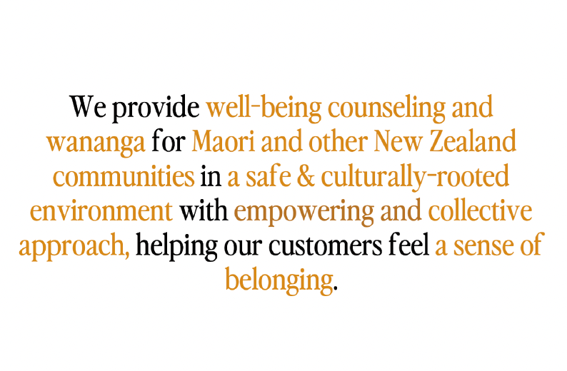
During the brand attributes session of the workshop, we found the following traits appear every time:
-Compassionate & Empowering
-Inspirational & Visionary
-Authentic & Culturally aware
-Artistic & Inclusive
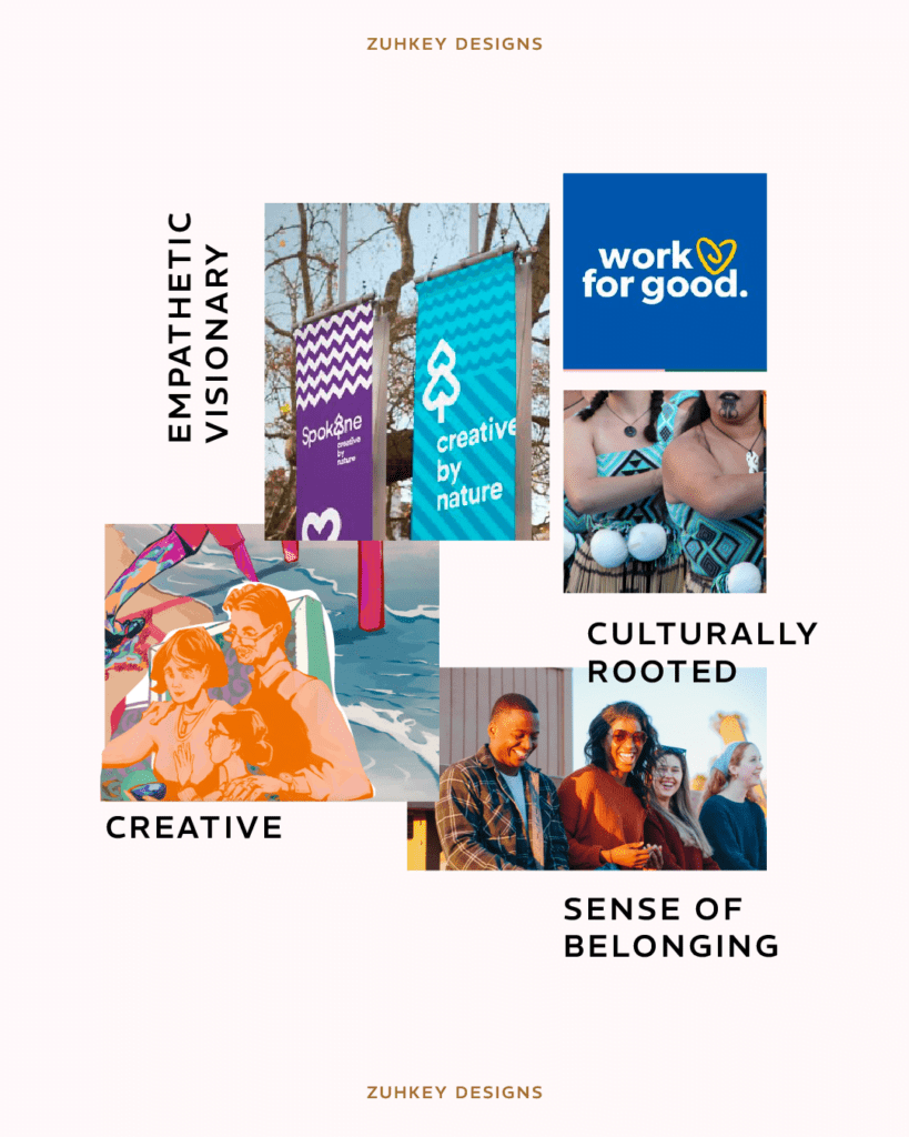
We realised that Te Hapori Ora’s brand archetype is The Empathetic Visionary.
The Empathic Visionary aims to create a holistic, safe space where individuals are not only cared for but are also empowered to transform their lives. They use a voice that is considerate, motivational, and descriptive, inspiring people to envision a better future for themselves while feeling supported and understood.
Photos in the stylescape are not mine, they were collected from Pinterest, Google and Unsplash
the creative direction
To visually present The Empathetic Visionary, we focused on three traits – Empowering, Visionary, Culturally aware or culturally rooted. These attributes guided our choice of imagery, colour palette, typography, and other design elements in the stylescape to emphasize the Maori heritage and the importance of community in Te Hapori Ora’s brand, highlighting the transformative impact Te Hapori Ora aims to have on individuals and communities and to reflect Te Hapori Ora’s commitment to serving not just the Maori community but also other communities in New Zealand.
old logo
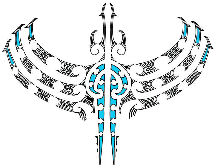
Pulling in the ideas and symbols of the old logo, I wanted to keep the same concept because of the backstory and meaning behind each element of the logo. It represented a traditional Maori art of a legend, the eagle, aka Hokioi, souring high up in the sky with its wings wide open.
the process
When one of the founders of Te Hapori Ora, Brendon Eriksen-Downs, reached out to me to do their rebranding, I was faced with a few challenges:
– preserving the origin or story of the original logo
– learning about the Māori culture
– designing a logo that will stand out and stand through time
I started with lots of sketches. Every design choice along the way wasn’t just about looking good but feeling right and true to the Māori heritage.

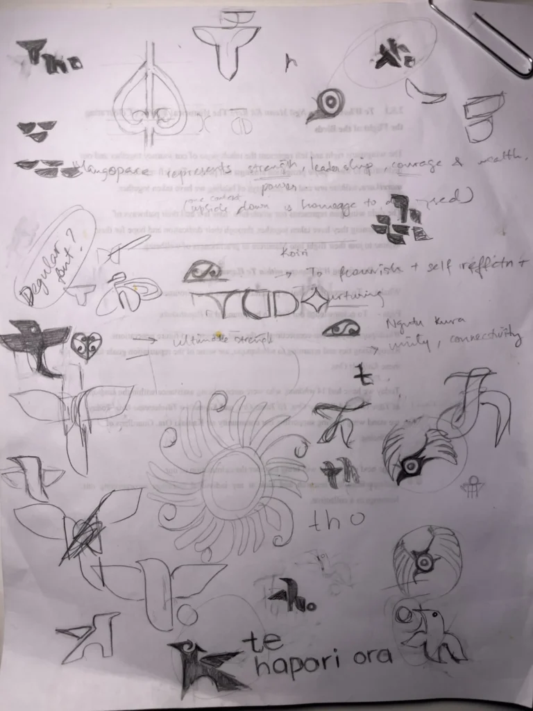
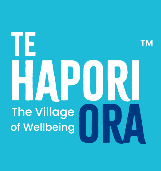
the new logo
For the logo of Te Hapori Ora, I really wanted the logo to feel like a symbol of collective strength and vision. The logo still represents a Hokioi . The hands forming the wings of the Hokioi represent unity, the eagle’s watchful gaze embodies deep understanding and connection, a nod to their guiding principle of making and maintaining family relationship aka whanaungatanga.
At its heart, where the spirit of their work lies, I’ve integrated a symbol that’s all about the life force and energy that they bring to their practice of wellbeing. The wings, etched with stories of journeys and healing, symbolize where they’ve been and where they are headed, collectively.

At the core of our brand identity system we’ve created a brand pattern.The pattern is derived from the Hokioi in the logo.
Included within this design is the ‘koiri‘, a pattern that symbolizes aspects such as flourishing, self-reflection, and nurturing. These are attributes that align with their values, indicating growth, introspection, and a caring approach.
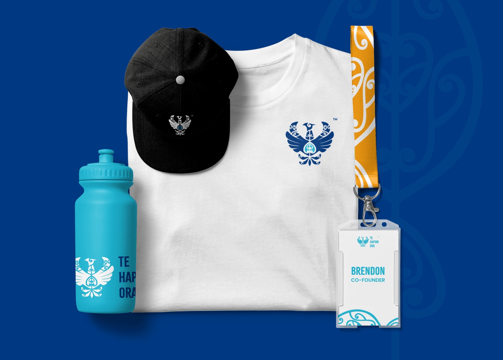
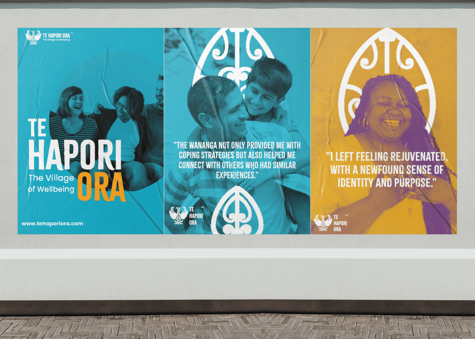


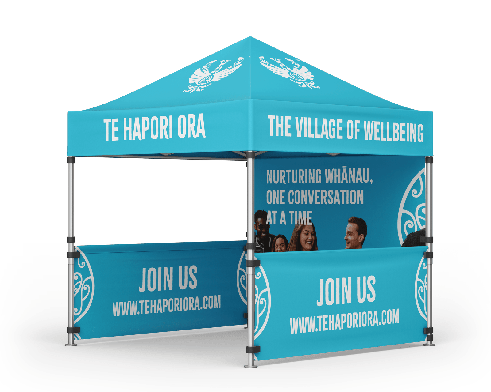
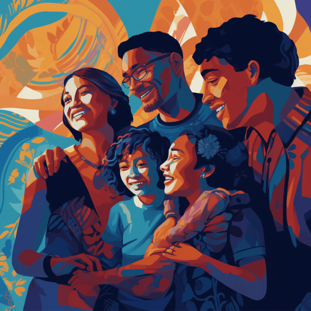


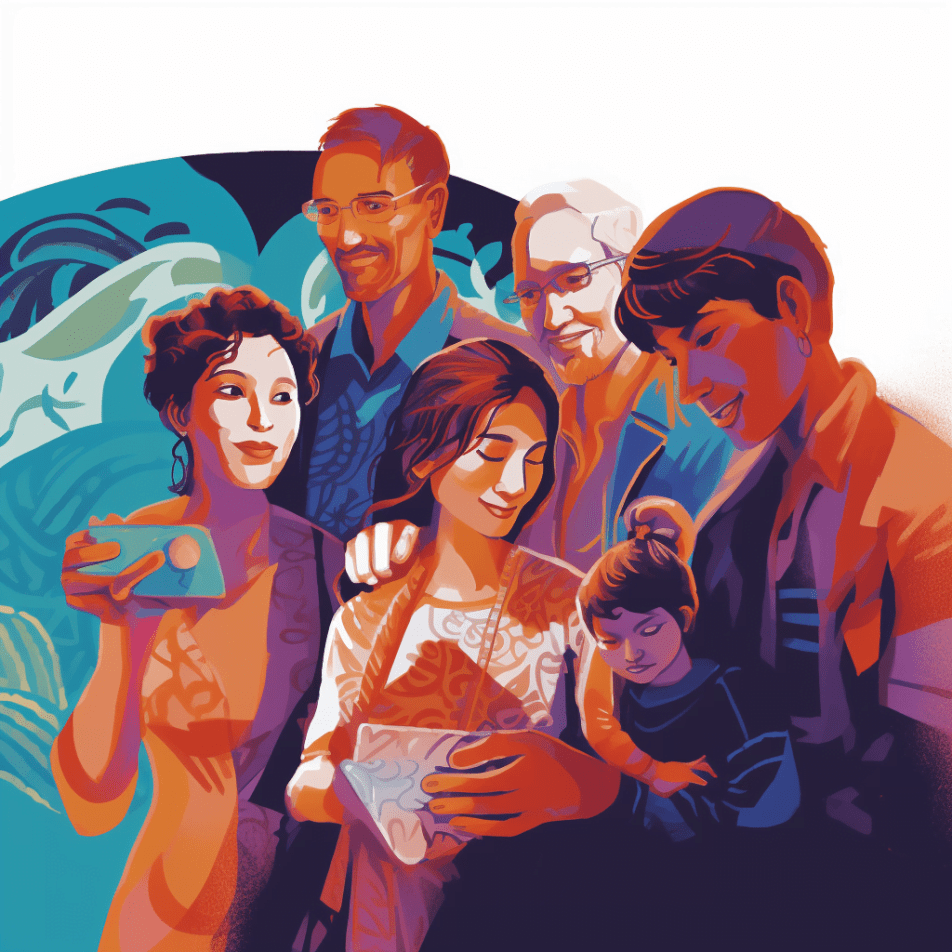
ILLUSTRATION STYLE
One of the things I noticed while getting to know their brand, is that they use alot of digital illustrations with a focus on emotion and expression for their posters and other type of marketing material. So I created some AI-generated illustrations with brushwork that imitates the texture and variability of crayons or HB pencils just to present the style of illustrations they should stick with for their brand.
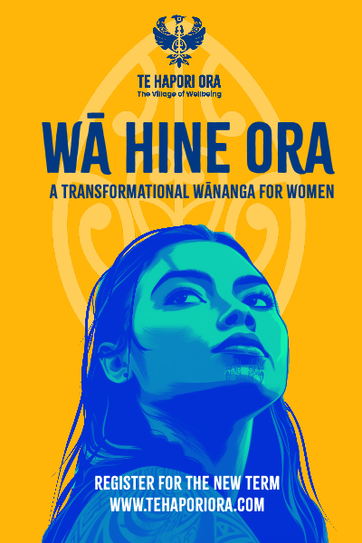
poster example (with old branding)
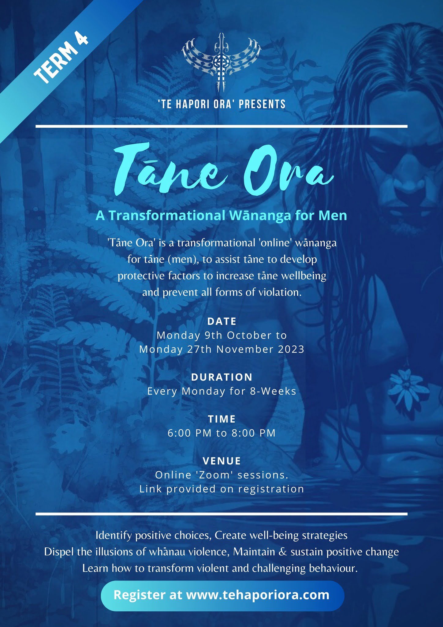
poster example (with new branding)
photography style
Each image is a vignette of shared experiences, showcasing the dynamic range of interpersonal connections within Maori communities. Their imagery conveys togetherness through diversity, pride, positive outcomes, community spirit, and we always show more than one person in the shot.
Our editing style is unobtrusive, maintaining the integrity of the original scene, with a slight enhancement to bring forth the vibrancy of New Zealand’s landscapes and the spirited expressions of our people. Subtle color tones or grayscale are sometimes applied to enhance the mood without overpowering the scene’s genuine warmth.


additional graphics
We also created some additional graphics that represent their programs or departments along with some icons for their website.

