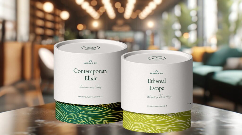
Berry Babes Co.

Berry Babes Co.

Berry Babes Co., founded by Tyra and Lilly, is a handcrafted chocolate-dipped treats & cake biz. They are expanding to their first store front location & need a brand identity that’s going to help keep them cohesive & consistent!

Deliverables

Brand Identity, Packaging design.

Industry

Food 

Solution

I wanted the brand identity to feel playful, feminine and friendly. I took a creative approach to the logotype by designing a handwritten font luring romantic, dessert-loving customers. The colour palette veers towards pinks and reds to invoke galentine vibes. The logomark is a heart-shaped strawberry, positioning this brand strongly in the chocolate-dipped treats segment as a romantic and friendly dessert brand. The custom packaging is definitely the front face of the brand – I wanted to design a packaging that felt very personal to the customer and enjoy the treats packed in.

logo variations

Colour palette

graphic elements

Classy Plates

Classy Plates

Classy Plates provide their subscribers with gourmet recipes with high-quality ingredients, ready to cook. Their customers are paying for more than just a meal subscription — they’re also getting a luxurious experience that makes them feel like royalty. They want their customers to feel like they’re dining in an exquisite restaurant, even if they’re eating at home!

Deliverables

Brand Identity, Website Design, Packaging.

Industry

Food / Meal Subscription Boxes

Solution

Since they wanted to attract a new target audience and get a more luxurious branding, I took a strategic approach to redefine their brand message and come up with brand visuals that resonates that.

Colour palette

secondary logo

logo mark

website design

Frosted

Frosted

Frosted is the newest and best-est coffee and donuts shop to make all your mornings better! Whenever you need a good pick-me-up, Frosted will be there and ready to smother you in love and sugar!


Frosted’s mission is to make people feel better and bring a smile to people’s faces – no matter how tired and hangry they are.

Deliverables

Brand Identity, Logo variations, Graphic elements, Website Design, Packaging.

Industry

Food, Health & wellness

Solution

I created a simple illustration of a wrapped doughnut and hot coffee cup to illustrate what Frosted is mostly famous for, that would then be used in the logo and in the brand pattern.

For the logo type, I used a rough, bold, retro font to mimic coffee stain

Colour palette

website design

The Tea Collective

The Tea Collective

The Tea Collective is an award-winning Australian boutique tea store. They provide artisan tea experiences and high end hand-blended teas.

Deliverables

Brand Pattern, Packaging design, Marketing Collateral.

Industry

Luxury tea blends

Gift box Packaging

I designed a pattern with thin curves to mimic the text orientation on their logo and their brand’s submark. I wanted to create a simple pattern that can be used throughout their packaging. I designed a side pattern that depicts different icons and illustrations that speaks to their brand message.

Gift Box Labels

I wanted to incorporate more borders and minimal illustrations and icons similar to the ones in the Gift box. Each collection label have different illustration illustrating the content of the gift box.

candle packaging

the lookbook

Abbiocco

abbiocco

abbiocco

Abbiocco (meaning: The feeling of drowsiness and satisfaction after a big meal) is the trendiest ice-cream shop in Italy! They are about to start selling their delicious ice-cream in supermarkets world-wide and think it’s time for a brand revamp.

Deliverables

Branding, Logo variations, Pint Packaging design

Industry

Food & Drink

solution

For the main logo, I customised a sans serif font to make it a little more curvy and added a smile at the bottom of the logo to portray just how yummy their ice creams are. You’ll see for that little smile in the logo submark too which unintentionally became more like the brand’s mascot.


For the packaging, you know those drowsy, unusual dreams you get when you take an afternoon nap after a satisfying meal? That’s what I depicted in the packaging. I had so much fun bringing my art style and branding together for this one!

The colour palette