Fable & Farm | Farm-to-table restaurant
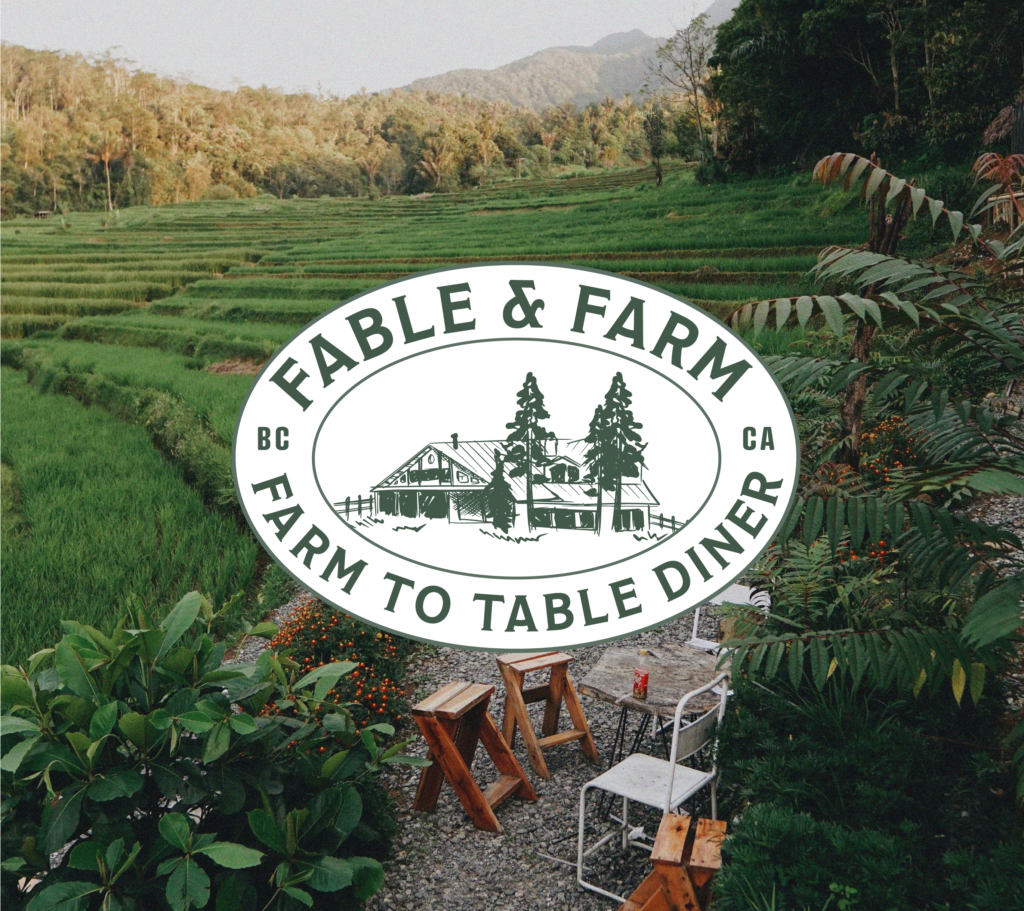
A case study Fable & Farm – A Farm To Table Diner Fable & Farm is a holistic farm-to-table restaurant with a seasonal and organic focus. Tucked away in British Columbia, they serve delicious, local grown food to food lovers who care about their meal’s journey. The Goal This was a passion project for which […]
Tovena
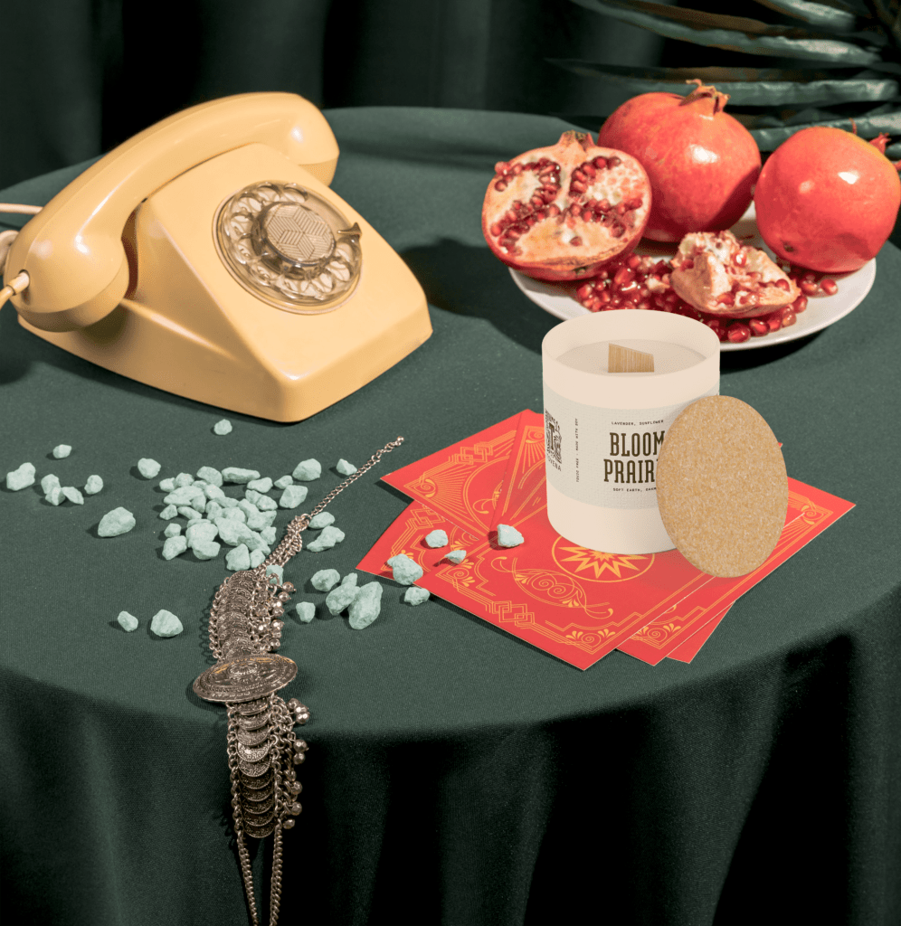
Tovena Nestled in the artistic and eco-conscious city of Austin, Tovena began as a fusion of environmental passion and a love for cozy, ambient lighting. The brand was born out of a desire to create candles that do more than just light up a room – they tell a story of sustainability, artistry, and wellness. […]
Lumina & Co.
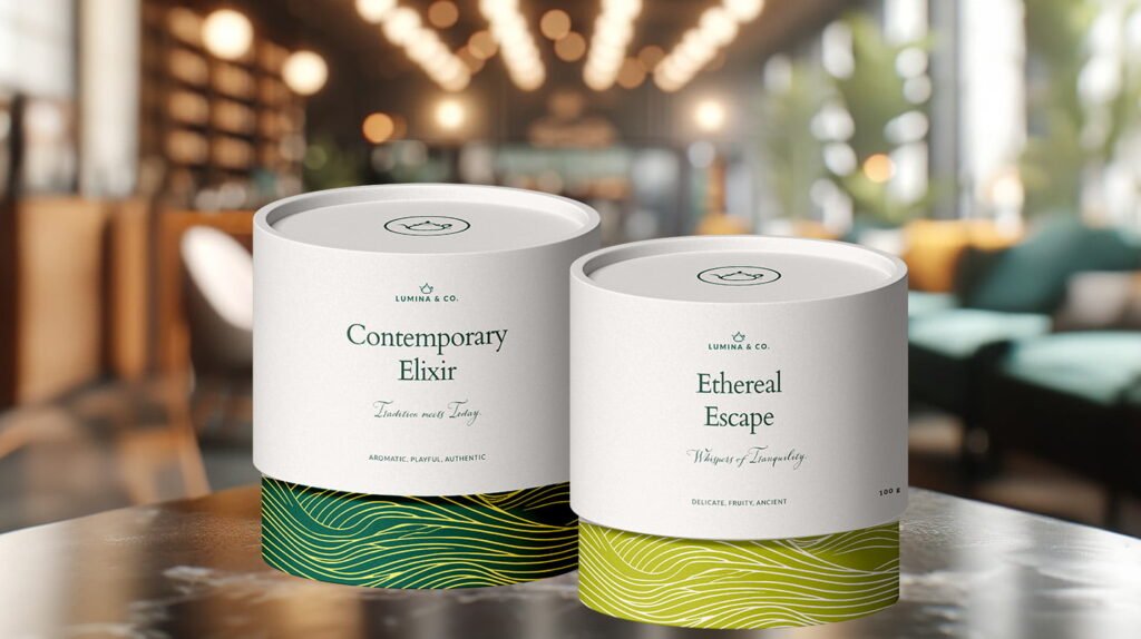
Lumina & Co. Lumina & Co is where the ritual of tea meets modern elegance. Drawing inspiration from the serene tea gardens of Asia and blending it with a contemporary touch, they create an oasis of calm for the urban spirit. Their mission is to infuse every cup with a story, building a bridge between […]
Nurses Ink
Nurses Ink Nurses Ink is a legal nurse consultanting brand founded by Myisha Jackson, a registered nurse. They offer medical insights to legal professionals, hospitals, insurance companies etc, who need help in understanding medical records during a legal case. scope of work Brand Strategy Brand Identity Industry Consulting defining the brand When we conducted the […]
Te Hapori Ora – The Village of Wellbeing
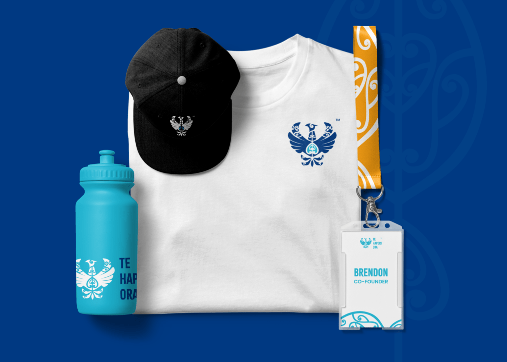
A case study Te Hapori Ora – The Village Of Wellbeing Te Hapori Ora is a New Zealand-based, non-profit organization, focused on community well-being. As indigenous practitioners (Māori), they provide a selection of Social Services that include: Practitioner Supervision, Counseling, Visual Coaching, Wellbeing Wānanga (like a course, programme and event all rolled up together) focusing […]
Berry Babes Co.

Berry Babes Co., is a new go-to for handcrafted chocolate-dipped treats and cakes. We designed a brand identity, crafted custom illustrations and GIFs, and developed bespoke packaging to ensure a delightful customer experience from the first look to the final unboxing.
Classy Plates

Classy Plates Meet Classy Plates, a gourmet meal box service that brings restaurant-quality meals straight to your home. Classy Plates provide their subscribers with gourmet recipes with high-quality ingredients, ready to cook. Their customers are paying for more than just a meal subscription — they’re also getting a luxurious experience that makes them feel like […]
The Tea Collective

The Tea Collective The Tea Collective is an award-winning Australian boutique tea store. They are all about celebrating the art of tea drinking with beautifully crafted products that elevate the everyday ritual of tea time. the goal When the founder, Becci Fowler, reached out to us, the goal for The Tea Collective was two-fold: first, […]
Blooma

Blooma Blooma is a flower shop run by a married couple who found each other through their shared love for the florist industry. They wanted to fill in the gaps where other florists fell short, that’s why Blooma offers a selection of services for anyone wanting to spruce up their home, office or other spaces […]
The Palms Villa

The Palms Villa The Palms Villa is a luxurious fictional private boutique hotel. Situated in the heart of Tanzania, Tanga, with stunning sea view and hidden between the majestic Peponi gardens of the Kwabada Forest park that are stretched behind the Villa, the Villa is a fusion of both traditional and modern Tanzanian and Italian […]
